top of page

REDESIGNING the neobanking module and onboarding process of India's largest fresh produce supply chain company
ROLES AND CONTRIBUTIONS
UX DESIGN
VISUAL DESIGN
DESIGN SYSTEM
BRANDING UPDATES
PROJECT COORDINATION
Ninjacart is India's largest fresh produce supply chain company that is solving one of the toughest problems in the world through technology.I got the opportunity to help them reimagine their onboarding process and the neobanking module of their app, along with a team of designers. The whole design process was based around
Assist, Trust and Focus.

Goals
1. Simplify the onboarding process and create a consistent design experience throughout the app usage.
2. The app should assist its userbase, it should create a trustworthy connection. Each screen of the app should be able to help the user focus on key functionalities and needs.
3. Redefine the overall onboarding process of the app.
Challenges
1. The core userbase were senior farmers who are not used to using technology or mobile devices for their day to day needs. Creating an experience that wouldn't overwhelm them was a crucial challenge.
2. Language was the next barrier. Most of the userbase of Ninjacart are non-english speakers. So, conveying updates and messages through local language was a challenge.
3. Ninjacart team's requirement of redesigning the app that can enable users to use the app without much third party support was also a great design opportunity.

Overview of weekly sprint process for core modules getting redesigned
Day 01: Understanding goals, painpoints, set success (HMW questions)
Day 02: Understanding user perspectives and needs (Persona and UJMs)
Day 03: Flows, feature listing, lo-fi designs (Dev meeting)
Day 04: Prototype creation and quick internal testing (MVP)
Day 05: Visual design initiation (UI Design)
Reinventing Onboarding stage to help the users confidently start using Ninjacart app
The user base has low technical understanding and places more reliance in traditional payment methods like cash than in technological advancements. As a result, many people are hesitant to adopt.
So, it was crucial to simplify the onboarding process for the user base and encourage them to do it independently without assistance from anybody else. Making the onboarding experience straightforward, comprehensible, and trustworthy for users was the design goal.
Solution: The app is now available in local languages, making it more widely accessible. Farmers and dealers can now choose their language and suggest one if it is not already available. Benefits are now visually shown with subtitles in regional languages, ensuring that users have a clear understanding of the app's information and the benefits they receive. Each stage is now accompanied with help links that provide a thorough and clear understanding of what each field means and where the related information can be accessed. Each step is double-checked to ensure that the information entered is valid, as some of these are critical business aspects.
KYC is now divided into clearly defined logical steps
Only seasoned tech users could use the existing KYC method. Yet even for them, it was really restrictive. Due to their knowledge gaps and the app's lack of support, users were forced to interrupt the KYC procedure midway.
Solution: After redesign process, KYC is now divided into clearly defined logical steps that may be resumed later from where they were left. Help is accessible for each stage, making it possible to complete the task without the assistance of others - this is critical for Ninjacart users, as some are hesitant to embrace the application due to the learning curve connected with onboarding. Error messages are well detailed about what went wrong.
Making neobanking modules accessible
The existing neobanking modules lacked coherence, with scattered and inconsistent information, and it was very much in need of a user-friendly redesign to reduce cognitive burden.
Solution: The solution streamlined money management processes, mirroring popular neobanking apps to ease the learning curve. More focus was on displaying essential information clearly, using conversational labels and concise status messages, while offering summarised views for most users and detailed options for advanced users. The redesign process created a seamless user journey by connecting related actions, ensuring users always had clear next steps within the app.
Design consistency with the creation of a new design system
The Ninjacart team aimed for uniformity in the app's design. The entire experience was fragmented since, as was previously mentioned, it was a fusion of concepts from several applications and each module of the app had its own visual style and design pattern.
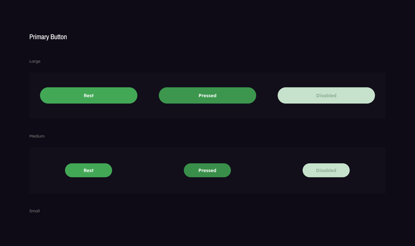
Solution: A new styleguide was created for the design elements for Ninjacart's future UI needs and app scaling purposes. This can ensure that ninjacart's future modules are also consistent with newly redesigned app.

Clear and concise. Help is there, all the time.
The present app's UX copy lacked clarity and self-explanation. Also, because some of the users were unfamiliar with applications like Ninjacart, it was important to ensure that they weren't lost at any point and that they could get assistance more quickly if necessary without having to go around the app itself.
Design sprint and being the scrum master
One of the requirements from Ninjacart team was quick iteration of design and timely delivery. So, I decided to divide their modules and features redesign process into a 4 week sprint workshop and I acted as the sprint master. Each week was focused on one particular module or connected features. I made sure their participation was there in key milestones in the process. I planned the whole design sprint activities for each days of the week with detailed plan for meetings with Ninjacart team. Also, assigned the tasks among the internal team.
bottom of page


