top of page
CREATING one of the world's biggest shipping news platform by meticulously combining 3 websites.
ROLES AND CONTRIBUTIONS
UX DESIGN
VISUAL DESIGN
DESIGN SYSTEM
BRANDING UPDATES
PROJECT COORDINATION
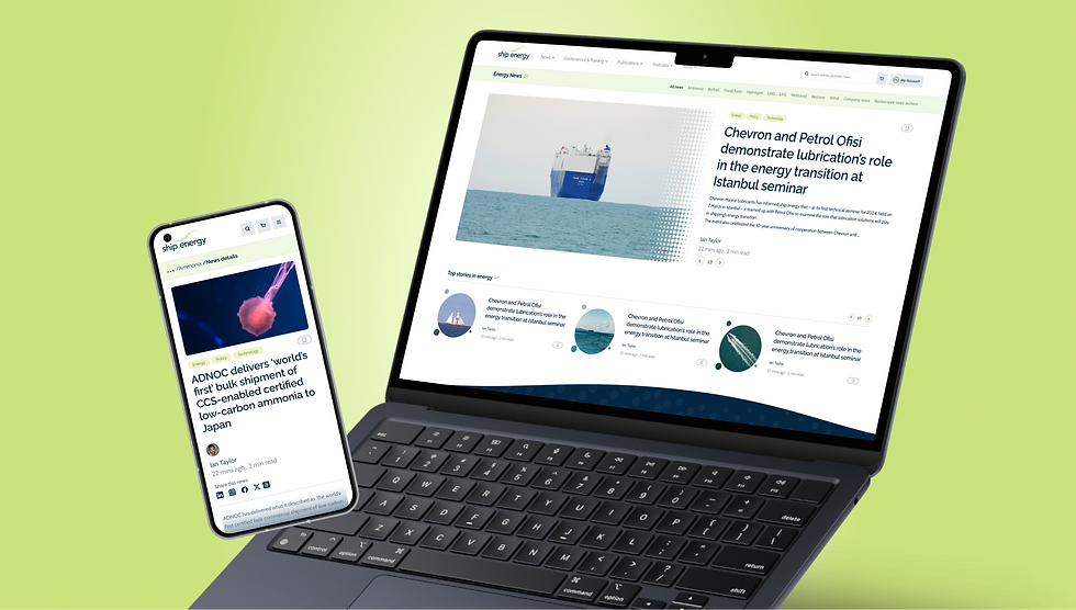
Last year, I worked with Petrospot - a long-established publishing and events company in the marine energy sector. The opportunity was to combine 3 different shipping and bunkering news platforms into a unified single platform called 'ship.energy' combining data and information from all 3 of them in a seamless manner with better UX and updated branding.

Goals
1. Combine three of Petrospot's website without breaking any of the currently provided services and in a better way with better UX and refined functionality.
2. Project ship.energy as a news website and a place for gathering any sort of knowledge and updates related to shipping, energy, bunkering and port around the world.
3. Accomodate the business requirements of the new ship.energy without intrusively affecting any experiences.
Challenges
1. The main challenge lied in how the vast data from all three websites will be combined without making the website overwhelming with information overload?
2. How to primarly keep the website as a news website at the same time showcase other aspects of ship.energy - its conferences and events, bunker related port updates, throw a light to its paid publications and podcasts.
3. Provide a new visual language based on their newly rebranded logo and base colours.
4. An improved conference registration flow, create a clear distinction between events and webinars

Overview of processes and steps used in design process
Discovery phase: The main aim was to find out exsiting UX issues with the current websites and come up with a proper research audit document which can be used to formulate problem statements and to use as a directive for the rest of design process. Methods used: Website audit (heuristic analysis, accessibility tests, usability tests), Stakeholder interviews (main stakeholders from all three websites), Secondary research.
Analysis phase: Based on the findings a proper information architecture was built with multiple stakeholder involved team workshops. Methods used: Focus group workshops, Multiple internal tests, Flow diagrams. Feature sets were finalised with the help of developers to align design - dev expectations.
Design phase: Design was done in batches with each batch concentrating on core modules, iteratively. This made the design process more structured and build up progressively. Methods used: Lo-Fi wireframes, Focus group discussions, Hi - Fi designs, Design system and component creation.
Dev handover and support: Dev handover was done after making tweaks, adjustments and connecting all components together. Still supporting the process continously if they have any queries or client have any new requirements.


Combining content, creating a better information architecture and navigation
This was one of the longest process. The final research report came handy for giving a proper start. The first process was nailing the sitemap. Unmoderated remote card sorting exercises were carried out on multiple iterations to arrive at the current sitemap. For navigation, I suggested a mega menu due to properly grouping complex menu categories into manageable chunks of information and categorisation and to make it less overwhelming for users. It also helped in throwing light on otherwise hidden but important parts of the three websites. Advertisements are now organically arranged throughout the website less intrusively. The content structured for scannability.


Making the registration process clear, concise and flexible
The existing registration process was very convoluted and the functionality was broken at multiple stages. It was essential to make a registration process that is more connected with rest of the website, user friendly, easily learnable and flexible while satisfying the requirements that arise with combining 3 websites. The new flow is less error prone and promotes the business requirements of ship.energy (upselling needs, adding perks, registering for multiple users at a time, etc)


Modular, consistent and flexible design components and structure
From the very beginning of the wireframing process modularity and flexibility were focus points. This helped in quick design iterations and updates. It also enabled in creating less custom components for different modules of the website and sped up design system creation, the hi-fi design process and development efforts.


Website re-design influencing the new branding and rest of ship.energy channels
The UI design process influenced positively the exisitng branding elements which were used on the social media channels, advertisements, event light boxes and bill boards. The digital colours and components used further seeped into rest of the design channel design elements as well.


Ninjacart
REDESIGNING the neobanking module and onboarding process of India's largest fresh produce supply chain company

Control Tech
UPLIFTING the UX and identity of an automation and engineering company through a website redesign process

Fotodust
SCALING UP a SAAS platform for studio owners and general users to help them manage all their photography needs
bottom of page